The last 16 years of Minneapolis bikeways in one seizure-inducing gif

I posted the following map on streets.mn today, which I’d made from a powerpoint presentation to the Transportation & Public Works committee a few weeks ago:

MplsBikeways1997-2003

It’s amazing to look back at 2001, when I started riding, and see how few lanes there were. We got by somehow, but it wasn’t easy or much fun at all. I made extensive use of all the contraflow lanes that used to be downtown, on Marquette & 2nd and on Hennepin. The former worked pretty nice actually, and in a lot of ways were better than the current Marq-2 configuration (in that there was actually accommodation for bikes). But the Hennepin lanes, which I guess you could call an “on-street, unprotected cycletrack”, were among the more terrifying facilities I’ve ridden. If you were heading towards the river you would nearly always overtake a car waiting to turn left, proceeding on a wing and a prayer that the driver was paying attention to what was behind them as well as what was in front of them. Even the pathetic green lanes are better than that, and the 1st Ave protected lanes are mostly much better.

Today’s network is much more impressive, especially on the Northside and around the U. But still much of the city has merely nominal facilities, like Linden Hills and Far Southwest or Northeast, and Nokomis and Longfellow have none at all. Additionally, most of the lanes are unprotected and the MPD shows little or no interest in enforcing them, so riding in a lane means frequent detours into general traffic lanes. On a recent Monday afternoon (not yet rush hour) ride on the 1st & Blaisdell facilities, I encountered six obstructions in about two miles. At that point you fail to have useful facilities.

Minneapolis has devoted a lot of wind energy (i.e. words) to making Minneapolis a great biking city, and these maps could be used as evidence that the plan is succeeding. But the conditions on the street don’t show significant improvement from 2001, and unless either the protected bikeways goal is vastly exceeded (30 miles represents only about 15% of the current, inadequate total bikeway mileage) or Minneapolitans get a lot nicer about respecting bike lanes, biking in Minneapolis will remain a much better talking point than a lifestyle.


Every street is special

If you want to ride a bike in Downtown, there’s a map for that.  If you want to catch a bus in Downtown, there’s a map for that too.  But what if you’re not sure yet if you want to bus or bike?  Wouldn’t it be useful to compare the streets where specialized facilities are dedicated to these modes (or pretendicated, in the case of Hennepin’s Green Lanes)?

Actually, if that was your goal, you might as well use Hedberg‘s amazingly comprehensive yet readable official Minneapolis Bike Map, which shows transit (although it doesn’t differentiate between Hiawatha, which is mostly separated from traffic, and a bus that runs in mixed traffic).  My goal was more theoretical – I just wanted to see at a glance which streets had been specialized for which modes.  I used Visio to alter a base map created by Public Works that was the most detailed map I could find in black & white.  Color was used to differentiate between the different modes in which the streets specialized, and line thickness was used to show degree of separation from other modes, which in Downtown conveniently corresponds to directionality (i.e. all of the separated facilities are also two-way; the old two-way bike lane on Hennepin would have been more complicated to symbolize).  I also included pedestrian specialization, which I considered to include bikes unless specifically banned (as on the typically deserted Fed plaza) or physically prevented from using the space (mostly because of stairs, like on Chicago’s connection to West River Pkwy).  Because Public Works’ attention is defaulted to car traffic, the base map included freeways in light green – luckily they are another form of specialization, but they don’t conform to my symbology.

Now that I’ve made this map of street specialization in Downtown Minneapolis, here’s some thoughts on the transportation network:

  • Downtown’s defining feature is a grid of around 20 blocks long by 10-15 blocks deep wedged into a triangular area.  Ok, that’s obvious, but you gotta start somewhere.  Also noteworthy is that the grid bends in the center-west and on the south, creating irregularities there, and is frequently interrupted along its periphery.
  • The heaviest activity is in the center of the grid, but there is intense activity throughout, with the only exceptions in an eastern area bounded by 5th & 11th Avenues and 3rd and 6th or 7th Sts, and a western area bounded by I-94, the 4th St viaduct, and I-394.
  • On average, there are ten blocks to a mile, but entry to Downtown is limited to about 12 gateways, mostly evenly distributed (about 3 to a cardinal direction) but not evenly spaced.  These gateways are created by the barrier function of the freeway ring  directly limiting access but also dividing the surrounding city into separate communities defined by freeway boundaries.  The river does something similar.
  • There is more real specialization for bikes than any other mode.  This makes sense, since people seem to like to get their bikes as close to their destination as possible rather than leave them at a central terminal and walk to their destination (people also don’t like to do that with cars, and maybe not with transit either).
  • Transit actually has more specialization than bikes if you count nominal specialization, in the form of bus stops and shelters.  There are a dizzying array of downtown streets with bus lines on them, but they aren’t really specialized because there is no advantage for transit to run there as opposed to anywhere else (a dedicated lane would be an example of an advantage).  The spread of nominally specialized transit streets is a weakness for the network, since transit benefits from clustering onto spines in order to compound frequency and increase system legibility.
  • Another caveat – looking at the map and assuming 6 lanes per freeway, there appears to be more specialized facilities for cars than for bikes.  The majority of the streets on this map also have specialized facilities for pedestrians lining them.
  • There is a huge network gap on the south end of downtown, basically from Hawthorne to Portland between 12th and 15th.  (Technically you could bike on the Loring Greenway but I rarely see that happen, maybe because you have to ride on the sidewalk to get to it.)  Do the conditions that require specialization further north not exist here, or have they just not gotten around to specializing?  The south end of Nicollet is not congested, but the high levels of transit service and use here would likely benefit from a modified transit mall, for example one that would prohibit cars from going through but allow access for parking and drop-off.  The south end of Hennepin, on the other hand, is similar to the Green Lanes segment, and the only rationale for not extending them is to allow unfettered gratification of suburbanites’ desire to drive Downtown.  In other words, Hennepin Ave south of 12th St is duplicated by 394 so there’s no good reason to continue its present prioritization of cars.  Extend the Green Lanes and enforce them.
  • Another gap basically cuts off the North Loop.  Local transit operates well there, with wide stop spacing and few stoplights, but the heavily-used transit service to the northern suburbs would benefit from exclusive lanes – I’ve mentioned before converting one of the viaducts to a two-way transitway and making the other a reversible two-lane highway.  As for bikes, the gap in the 2nd St bike lane can only be attributed to disinterest on the part of Public Works – the two blocks lacking lanes shares the same width as its neighbors with lanes.  The North Loop has actually lost bike lanes lately, as the lanes on one side of 5th Ave were converted to parking.  This neighborhood has obvious problems with street connectivity in this direction, so this lane should be restored and connected to 7th St N, maybe as part of the Interchange project.
  • The third gap is in Elliot Park, where the city is reluctant as usual to remove parking to add bike lanes.  It seems reasonable, though, to add a lane each to 7th and 8th on the stretch east of Portland where demand for turning is low.  I have also called for a transit mall on 8th St – 9th or 10th might work too.

I’d like to pin a tangential coda onto this already long-winded post.  From the above it can be gathered that there is already a great deal of specialization on Downtown streets but I’d like to add even more.  To understand why, I offer the chart below, showing that the population of Downtown as measured by the 2010 census is greater than all but 25 of the Metro’s 90-some municipalities:

Ok, so # 26 wouldn’t seem to be a big deal, except for the fact that at 2.6 sq mi Downtown is a third the size of the next smallest city on the list, Richfield.  In addition, only 5 cities on the list had a similar or higher growth rate to Downtown, which is poised to overtake Brooklyn Center, Andover, Roseville, and Richfield assuming the same growth rate in this decade.  Of course, that won’t happen, but if the first two years of this decade are any indication, it’s certain that Downtown’s growth rate will outpace all but a few of the Metro’s large municipalities.

High population in a small area means density, something that isn’t very common in the Twin Cities.  That means we should expect the transportation system to look different Downtown as well, and a reasonable response is to specialize street space so the different modes can perform their best.  Unsurprisingly I have an idea of what the ideal specialization would look like, and I’ll get around to posting that map sooner or later.

Boston & Minneapolis Family Feud

Sometimes it seems like Minneapolis was begat by Chicago, the two cities sharing a relentless grid, constant bluster, and a fixation with lakes.  But no, we were born of Boston; only the Eastern city was populous enough at the time to supply the requisite real estate speculators to found this like they did most other American cities (soon after, Chicago overtook Boston in population and was able to spread speculators far and wide).

But parent and child are very different, as I was recently reminded by Bostonography, a blog that rivals Mapping the Straight in terms of cartographic cleverness.  Here’s Bostonography’s awesome map of MBTA bus speeds.

Bostonography’s map reminded me of a similar one of Minneapolis peak hour bus speeds produced for the Downtown Transit Circulation Report:

The above two maps are not to scale, of course, but they are comparable in some ways.  It’s really interesting to me how closely spaced many of Boston’s bus routes are.  For example, in the area southeast of Malden Square on the map above, there are lines on Main, Hancock and Ferry Sts, all within about 1/3 mile of each other.   The lines on Main and Ferry are pretty frequent while the Hancock bus isn’t, but they appear to serve an area relatively similar to Minneapolis.  Areas that are more like the the dense brick Boston of the popular imagination, for example the South End or Roxbury, seem to commonly have bus lines 1/4 mile apart!

I’m not very familiar with Boston’s geography, and Minneapolis’ survey line street layout make it a snap to plan a bus network.  Still, Minneapolis’ bus routes clearly continue to follow the old streetcar lines rather than adapt to changing circumstances.    I don’t know the history of the MBTA, but it looks like a lot of bus routes are set up to be feeders to the T rather than usable in their own right.

There are important differences between the two maps.  One that makes it difficult to directly compare the speed data is that the Boston map shows the actual speed as the buses travel along their routes (wow!) but the Minneapolis map shows average speed over segments.  That means that although you see a lot more yellow on the Boston map, the average speed there may be closer to the ubiquitous orange of central Minneapolis.

Minneapolis may be a prodigal offspring that long ago parted way with its parent, but it seems that Boston and Minneapolis can still learn from each other.

1895 Paving Map

I came across a paving map of Minneapolis from 1895, and I had to post it here, considering the two posts I’ve done about street paving.

Here’s a detail (although it includes just about all the paved streets in the city at that time); click for the full map:

Yellow = cedar block; Blue = granite block; Brown = sheet asphalt; Red = macadam

I knew that wood was cheap in 19th Century Minneapolis, but I didn’t know how cheap.  My guess is this stuff was imported, however, depending on the type of Cedar used.  I’m not sure if this is the same type of paver you can still see in a few patches on 8th Ave NThis article implies that Minneapolis switched to pine in the decade after this map was made, but apparently Chicago was still laying cedar block pavers in 1909, albeit quite different in appearance from the ones on 8th.  Just another mystery of history…

(Credit:  I’m not sure, exactly.  Someone at the U of M has a huge online library of old maps.  Several are similar maps produced by the City Engineer, but most are of sewers.)

Update:  watch the spread of asphalt and brick in paving maps from 1899 and 1910.

How do I map thee?

A couple weeks ago I wrote about the outstanding new online Minneapolis Bike Map, which I adore but, due to an emotional defect, could only find unpleasant things to write about.  The father of this map, Nat Case, map scientist of Castle Hedberg, wrote in to encourage me to check out the paper version.  Considering the fact that they designed the map for paper, it is only fair to check it out, but I’ll put my habit of being unfair aside and actually follow his suggestion.

Right off the bat, I need to clear the air.  In the last post, I failed to credit good Sir Case for the innovation of mapping bike lanes on the actual side of the street they are striped on – which a) is an indication of the unsafe practice of left-side striping, b) allows the portrayal of contraflow lanes and c) gives a quick indication of whether a street is a one-way, which tends to be unpleasant to ride on.  So kudos to you, Nat Case, for creating a technique that will soon be as ubiquitous as velcro, but for bike maps.

The paper map is really big – and really great.  The white streets are much less overwhelming at this size (maybe I just need a bigger computer monitor).  The differentiation between “local streets” (darker) and “busier streets” (lighter) is a lot more apparent on paper than online, and it sure is a useful distinction.  I like that the streets where “bicycles [are] prohibited or strongly discouraged” are so dark that they blend into the background – they are, after all, contrary to the spirit of multimodalism that infuses this map.

My main criticism of the online map – that symbolizing on-street lanes with dotted lines made them seem impermanent, especially since many of them are in fact not yet in existence – is still present in this map.  Actually, the large format of the paper map seems to make off-street paths more obvious, reinforcing my belief that they both could have been symbolized with solid lines, leaving dotted lines to symbolize planned bike lanes and paths.  If it still would have been too hard to tell the difference, how about making them different shades of red?

But overall, the new map is really good.  A beautiful, suitably Minnesotan subdued color palette, chock full of bikey info, and maybe best of all: loaded with lanes, paths and other bike facilities.  We really are lucky to live in what is (or will be) one of the nation’s best biking cities.

Is it a sidewalk or a bike path?  It’s Twins Way!

One more piece of unfinished business from that post a few weeks ago – Twins Way, the sidewalk that Hedberg was compelled to mark as an off-street path.  If only someone was similarly compelled to mark the actual Twins Way.  Instead the cyclist who hangs a left upon exiting the Cedar Lake Trail will find no indication that they are on a bicycle facility.

But what a sidewalk!  I’d guess it is 15-20 feet wide, since it appears about as wide as the asphalt next to it.  But a bike path?  Who knows?  It seems more logical to conclude that the sidewalk is wider than usual because there isn’t a sidewalk on the other side.  The path isn’t particularly suited for bikes – there are beg buttons at the intersections, and at least one is very difficult for cyclists to reach.

I don’t get hung up on strict mode separation, but this design seems ill-suited to a city where the only police interaction with cyclists is to ticket them.  It’s unclear whether this stretch is in a business district, but riding on the sidewalk isn’t a good idea anywhere.  It seems like a waste to tear up brand new concrete, but some kind of marking should be added.  I’d suggest the following sign:

Twins Way would have been a good candidate for a woonerf.  It has low auto traffic, except for around gametime, when the traffic-calming qualities of a woonerf would have been ideal.  The intersection around the could have been asphalt, and the rest of the road a wide expanse of brick pavers.  I’ll be sure to suggest that next time they build a stadium.

2 items about bikes

Like most people, I love to ride bikes.  But there are lots of great local cycle blogs, and frankly it’s a mode that I’m less interested in intellectually, so I don’t do a lot of posts on bikes.  A couple things came to my attention recently, though, that I’m going to spend some finger energy on (that sounds kinda gross).

Zombie cyclists from hell spreading love

I used to go to the Whittier Alliance’s Community Issues Committee every month, and just about every month I was entertained by the nonsensical, self-serving, antifactual opinions of some yokel.  To be sure, there were a lot of clever and astute opinions shared as well, but they were less entertaining than the crazy ones.  I remember one occasion when the Midtown Greenway Coalition presented on their search for potential park sites along the greenway, where access points to the path would be combined with community gathering spaces – the idea was to improve greenway safety by getting more eyes down there while getting neighborhood buy-in through the green space.  The Whittierites hated it.  The general opinion was that a neighborhood approached from below was repugnant to decent sensibilities, and sure to result in situations similar to zombies rising from graves in search of brains.

Now there’s evidence that their argument was not only inane, it was thoroughly backwards.  Human Transit today expands on research finding that people traveling upwards tend to be more giving, and speculates that people prefer going up to going down.  I’ll see his speculation and raise him one conjecture:  I’ve noticed that many of the cycletrons zooming around town also seem to be fairly patriotic about Minneapolis (or maybe just a part of town called Mpls).  Is this because the first thing they see after emerging from their subterranean speedway is through benevolent eyes, thanks to the “up escalator” effect?

How to get a Hedberg in cycling

One of my favorite things about Minneapolis is Hedberg Maps – surely the Consumer Mapping Champion of the World, if there were some island where the world’s consumer mapping companies were stranded and forced to fight using randomly-strewn rusty auto parts.  Hedberg is the master of cramming tons of info into a map using a clever palette that leaves it clean and appealing but informative.  They are also noteworthy for producing thematic maps on topics so obscure they could only be of interest to a handful of fanatics, for example interstate highway numbering, Santa Claus and the Wisconsin Dells.  Hedberg is located in the labyrinthine, art-riddled Northrup King building, and are very friendly – I recommend stopping by after you finish your dog at Uncle Franky’s.

Anyway, fresh off the completion of their Twin Cities Dog Lovers map, Hedberg banged out Minneapolis’ new bike map, which has a helpful zoom-able online iteration.  Despite not having seen a paper copy, I have a few comments on the map.

  • This one seems less up to Hedberg’s aesthetic snuff – giving width to every street in the city (as opposed to depicting them as lines) makes for a pretty overwhelming map.  They maybe should have minimized the many streets that don’t have features.
  • The advantage to giving streets width on a bike map is that you can show which side of the street the lane(s) are on.  So why do they bother to symbolize on-street lanes differently from off-street shoulders?  Wouldn’t most readers figure out that the off-street facilities are the ones without streets attached to them?
  • Compounding this last problem, many facilities depicted on the map do not yet exist.  They are distinguished by adding the year 2011 in red on some part of the segment-to-be.  There are two problems with this approach:
    • The reader is not sure which part of the segment has not been striped, especially because dotted lines are often used to show planned features.
    • Minneapolis is not known for its punctuality in striping bike lanes (I have an email from Shaun Murphy claiming the 1st-Blaisdell lanes would be striped in 2010).

      Twins Way or just a highway?

  • There is really an awesome amount of detail here.  I especially like the inclusion of Hi-Frequency Bus Routes. Not sure about the inclusion of the Nice Ride stations though – these tend to move around a bit, and supposedly there will be a bunch added this year, making the map obsolete.
  • I found one error:  They striped an off-street trail on the west side of Twins Way.  If there is meant to be such a facility there, I’m pretty sure it’s not indicated with signs or pavement changes.  There is an extra wide sidewalk of stamped concrete but nothing separating modes or even indicating that you can bike there (is a parking ramp a business district?).

Considering Minneapolis Bike Program’s Government 2.0 attitude, I’d guess they gave us a chance to comment on the map and I missed it.  And even though I just found 5 things wrong with it, I actually like the map, particularly the detail and the zoomability.  I’ll keep dreaming of the perfect map, but in the mean time I’ll actually be using this one.


A sprawling post about density

My grandmother did not speak English on the day, early in the Great Depression, when she started school in a one-room schoolhouse on the flat former beds of glacial Lake Agassiz. She spoke only Plattduutsch, a lingual hybrid of German, Dutch and English that her grandparents spoke even after coming to Minnesota from a comparably flat area of Germany.

The Itzen clan of Itzen Corner, Grant County. My grandmother is seated in front, far right, and frowning.

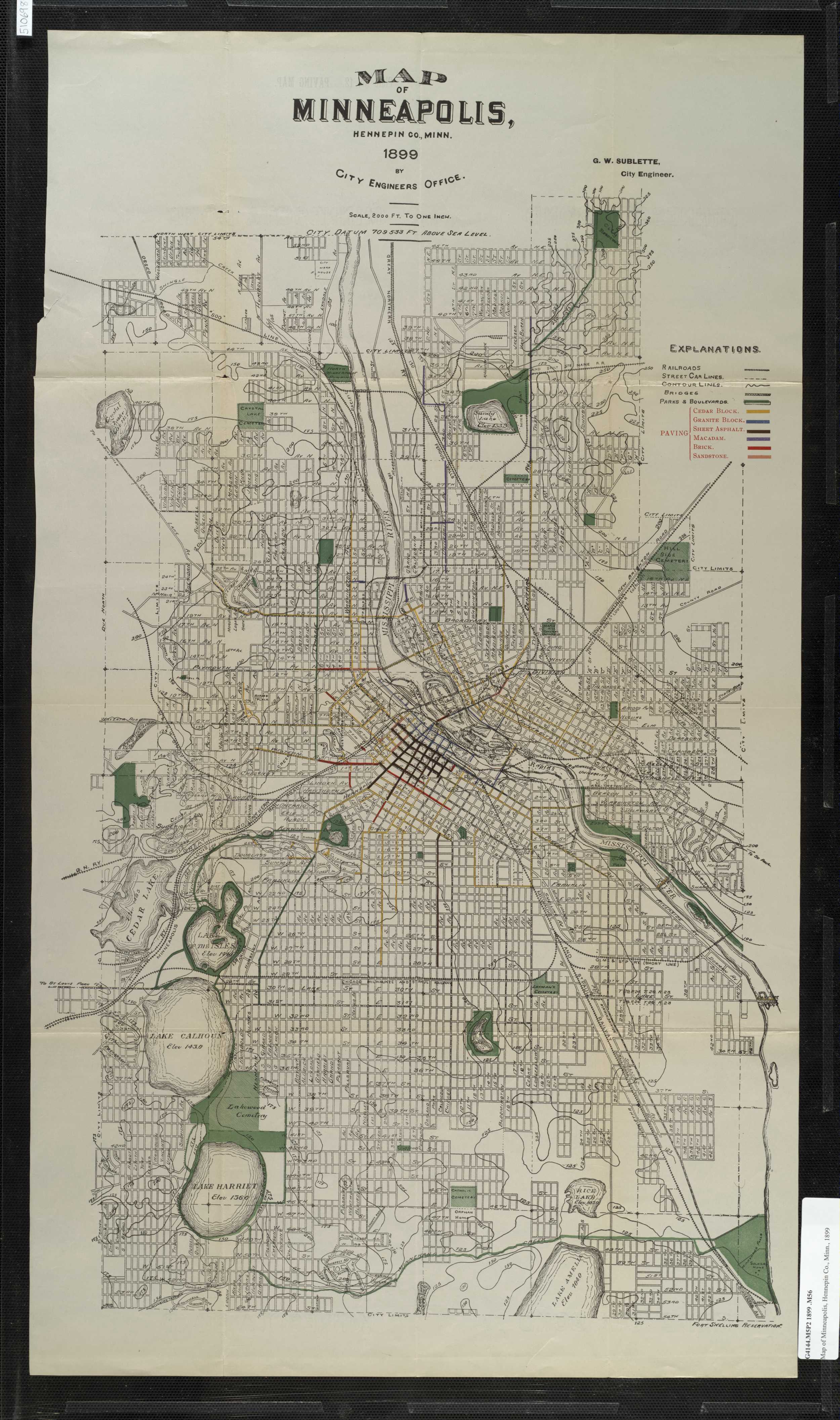
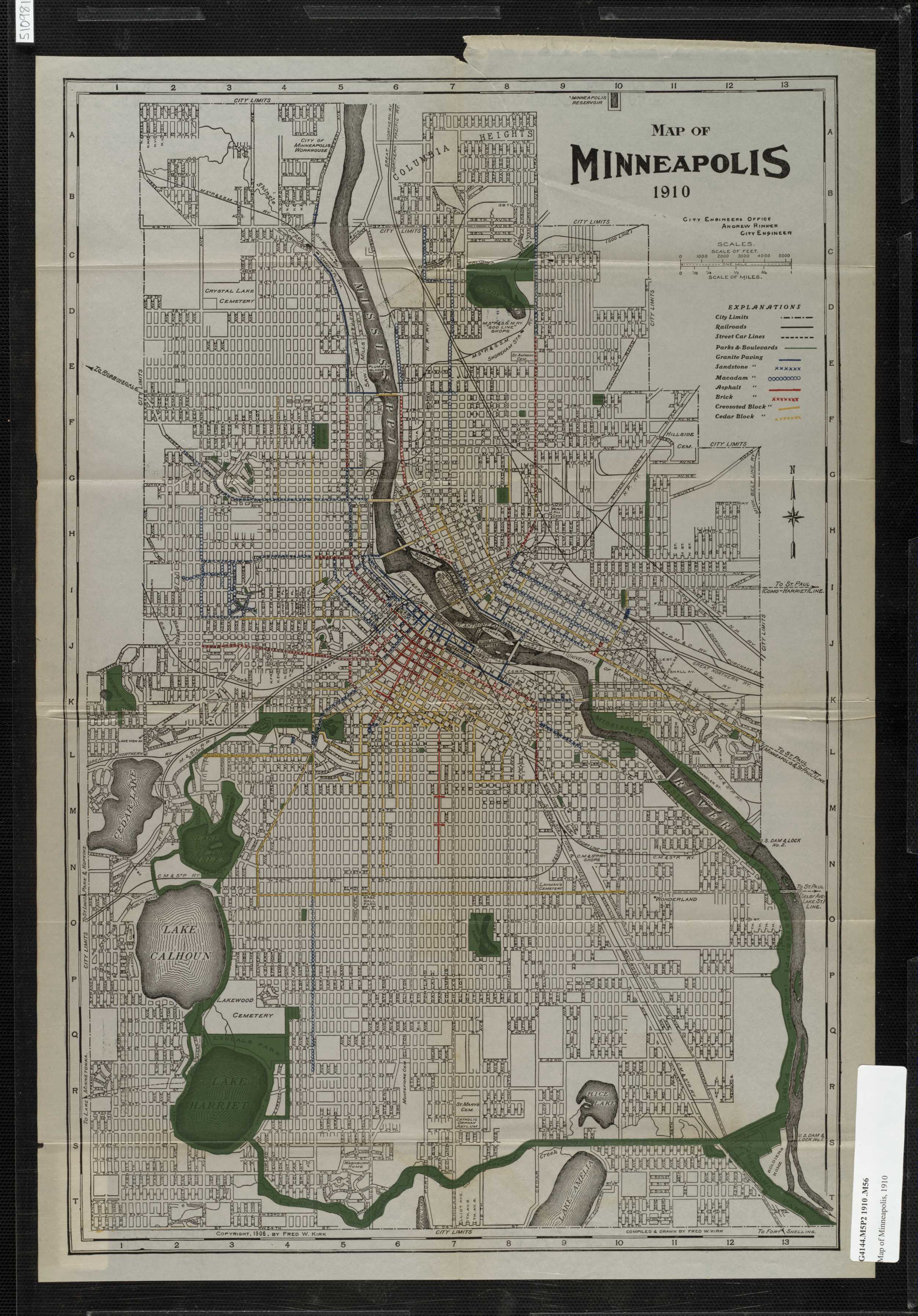
The farm she grew up on was electrified a few years before my grandmother graduated from high school, after her father had finally saved up enough for a windmill generator. which only powered one room.  My grandmother would disobey her father, one of the sternest-looking men in the photo above, who did not believe that women needed higher education, and go to a teacher’s college.  She graduated, of course, and couple decades later taught from the Atlas of Minnesota Resources and Settlement (at the Book House, a bargain for $20), which was produced in 1968 by the now-defunct State Planning Agency thanks to a grant from HUD.

And thanks to the thrifty habits of my grandmother, a child of the Depression, a copy of the Atlas in good condition is now in my possession.  Never before and never again was a compendium of this detail and quality of geographic information published in Minnesota.  My grandmother claims that these were quite common in classrooms in the Golden Age of Minnesota, the late 60s and early 70s.  I, on the other hand, had one semester of Minnesota history, in the 4th grade, and exactly zero semesters of education in the geography of Minnesota.

My grandmother writes her name on every book she has


I spend a lot of Sunday mornings paging through this book, and wish more than anything that its progression of thematic maps didn’t end in the 1960s.  For the sake of an exception that proves the rule, here is a progression of maps of passenger rail volume that might as well end in the 60s, since it was all downhill from there:

The craftsmanship and idiosyncrasy of these maps really pop off the page to eyes accustomed to the products of ArcGIS.  I guess that’s why the U of M named their map library after one of the authors.

One map in particular caught my attention in light of my recent obsession with density in Minneapolis.  It comes right after a map depicting the percentage of dwelling units that are multi-family in the Twin Cities (in 1950):

One of the things I love about maps is the thousand words thing, that they contain so much more than their title announces.  This map, for example, is not just a snapshot of apartments in one metro area at mid-century, instead when viewed in conjunction with the map on the next page, it tells an untold story of suburbanization:

That untold story is of apartment-dwelling suburban pioneers, and actually it won’t be told here either, since I’m interested in what these maps say about the central city of Minneapolis.  Just a glance back and forth at the two maps shows, for example, that density intensified in the center and spread south and west, rather than north.  But I’m less attracted to the isopleths than the weighted dots representing units added between 1960 and 1966.  Assuming the largest dot on the map is the same value as the largest dot in the legend, Minneapolis added 11,685 multi-family units in just those 6 or 7 years! That’s twice the rate of last year, considered a pretty good one for multi-family rentals, if not for other housing types.

It is also puzzling, considering that the 1970 census showed a 5,959 unit decline from the 1960 census.  I actually have been studying the density of multi-family housing units in Minneapolis by neighborhood and year for my downtown potential population project.  I have compiled the units per acre density for 343 buildings in Minneapolis – that includes just about every building built downtown last decade but doesn’t come anywhere near the total number built in the 60s – and found another 3,555 that were built from 1967 through 1970.

Even taking the low figure of 15,240 units built from 1960 to 1970, for the total units to have dropped by 6000, at least 20,000 housing units must have been destroyed in the 1960s! With an average household size of 2.7, that accounts for the entirety of the drop in population of 48,472 between the two censuses.

Speaking of the 1970 Census, while it doesn’t consider a 6000 unit decline worthy of mention, it does describe Minneapolis’ 10% drop in population.  Like a conspirator calling a victim’s cause of death “heart failure,” it blames the population decline on “outmigration.”  Migrating seems like an obvious course of action if your house is destroyed, huh?

So who or what was the culprit for this mass razing?  I first thought of that ancient nemesis of urban planners (and, of course, at one time valued friend) URBAN RENEWAL.  The only problem with that theory is that by the 1960s the Minneapolis HRA was finished with most of its clearance activities.  Some wrecking balls were still swinging in the Gateway District as late as 1961, but my understanding is that the small clusters of 19th century hotels that provided the dense housing were mostly gone by the last years of the 50s:

The map above does list one clearance project from the 60s, however.  I don’t know what the goal of renewal in the Grant neighborhood was, if there was a goal, but after several decades it ended up as some school buildings, a park, an expansion of the Sumner Field housing project (which of course was re-cleared a few decades later), and several still-vacant lots:

historic aerials

historic aerials

historic aerials

It is hard to tell exactly how many units were cleared in Grant, but the seven blocks cleared could not have totaled 6,000 units, much less 20,000. Urban Renewal must have had an accomplice, but lucky for us that accomplice may have unintentionally revealed itself at the top of those same photos. This accomplice was Urban Renewal’s partner in crime in cities throughout the US, and is even listed in the Urban Renewal map above, under the name Near North Side and the year 1968.

I’ve tried to imagine how the conversation went, “Your life sucks here in Minneapolis! Burn down your neighborhood and they’ll build you another one.”

Hy Rosen, quoted above, owned a store on Plymouth and Logan at the time of the riots that burned out most of the businesses in the neighborhood. He wasn’t the only one who connected the 1967 riots and the urban renewal activities that began a year later.  Here’s the contemporary NAACP president Matt Little, from a July 19, 2007, Star Tribune article, on the riots:

“Sometimes it takes extreme action to get things moving,” he said.

Within 10 years, Little said there were noticeable changes along Plymouth : A shopping mall with a pharmacy, a hardware store and a grocery store. Farther down, he recalled, new housing, a barber and beauty shop and a bank were established.

“The powers-that-be delivered on some of the things the community had been asking for,” said Little, who was involved with the Minneapolis NAACP for more than 40 years. “It woke up the establishment to the plight that some blacks were going through.”

He also noticed that some of the businesses that arrived in the ’70s were gone 20 years later.

As stated in the article, the businesses arrived in the 70s, suggesting that most of the renewal activities took place outside of the decade in question.  So if Urban Renewal and riots played a small part in the Great 60s Tear-Down, what played a large part?

To answer that question, I’m going to digress for a moment.  With the completion of the Crosstown Commons project, some media coverage called it the most expensive road project in Minnesota history.  That seemed unlikely to me, and sure enough, I-394 cost $450 million, a damn sight higher than the Crosstown’s $288 million (although the Crosstown is more expensive per mile).  394 is the only freeway I’ve been able to nail down the costs for, but it always seemed to me that 35W, which leveled some 40 square blocks of South Minneapolis, must have cost the most.

35W leveled 40 square blocks.  And when was 35W built?  1966 and 1967.

35W and 94 were routed right through some of the densest parts of the city, which at the time were considered loathsome slums and the people who lived there considered loathsome slum-dwellers.  When thousands are forced to move, they have to move somewhere, and likely the triggered the sort of succession patterns described in books like Making the Second Ghetto.  In other words, it is likely that the massive movement of population triggered by the destruction of freeway construction was a major impetus for white flight.

www.historicaerials.com

www.historicaerials.com

www.historicaerials.com

www.historicaerials.com

My grandma says good riddance to those crowded old neighborhoods.  She says good riddance to the 60s, too, a decade with too few highlights that did not involve her children.  But we still have to deal with the consequences of the decades of disinvestment that followed the destructive path of the freeways.  My former landlord Larry, a 40-plus year resident of Whittier, says that today the neighborhood is better than ever.  I hope it stays that way, but history is my guide, and that cuts both ways.

More map madness!

As long as we’re nerding out on amazing map websites, I need to bring up a great resource brought to us by the European Environment Agency (i.e. the government).

EEA’s web page has tons of thematic maps about all kinds of social science themes.  I have only dipped a toe into this cartographic sea, but I already found a gem:

This map showing patterns of sprawl since 1990, indicates that most of the sprawl is happening in the Netherlands and Germany, with some big pockets in Spain and Ireland.

There are also some great charts on this site.  For example, this one showing transportation infrastructure as a percent of land use in the 13 accession countries:

I predict hours will be wasted exploring the EEA site!

Mapnificent – finally

TC Streets for People links to an amazing mapping web app – Mapnificent – that draws a bubble on a map that shows you how far you can get from any given address in any given time – using transit!  The developer of this site – like Beldar – comes from France, of course.

Work be damned, I’m toodling around on the site this morning, checking out my house, my brother’s house in St Louis Park, my old place in Whittier, my old place in Kingfield, and the place I wanted to buy in St Louis Park.  The default time setting is 15 minutes, but I changed it to 20 minutes – it seems like if something is 15 minutes by bus, it’s in walking distance.

The first thing I’ve noticed is that the size of the bubbles does not vary greatly between the different locations I chose.  What does vary is the shape of the bubbles.  Uptown and Kingfield have an elongated shape – reflecting the emphasis on North-South routes in South Minneapolis as well as the failure that is the 21 line.

St Louis Park has an East-West orientation, since basically the only usable line there is the 17, which runs on Minnetonka Blvd.  However, this address is near an express bus stop, so there is an enclave in Downtown Minneapolis as well.

Seward and Northeast have a more triangular appearance, due to the viability of E-W and N-S service.  Seward has the bonus of an archipelago of enclaves strung down the Hiawatha line – more on that after the pics.

(btw, I’ve tried to present all of these maps at the same scale so the area could be perceived easily – it would be nice if the author of Mapnificent could include an area sum to accommodate nerds like me who like to collect this data in tables)

What’s extra cool about this site is that the bubbles don’t just represent the area that contains bus stops that can be reached in 20 minutes- it is the absolute area that you can get to in 20 minutes by (1) walking to the nearest stop(s) from the address you entered (2) riding the bus (3) getting off the bus and walking to your destination.  So the circles get smaller the further you are from your destination because if you get off at a distant stop, you will have less time to walk and still make it within your set time frame.  Really well done.  Unfortunately it isn’t smart enough to map where you can actually walk – more on that later.

The fun doesn’t stop there – Mapnificent also calculates your mobility if you are bringing a bike along.  It really swells the bubbles, but it doesn’t appear to take into account separated paths, which are generally faster than city streets.  Like I mentioned earlier, the bubbles are the areas around the stops that are walked or biked at the average speed in the given amount of time.  It might be nice if you could then choose the distance you are willing to walk or bike to and from stops in space rather than time.

The other setting (mysteriously marked as ‘expirimental’) that can be manipulated is the time of day/week – this is necessary because many routes only run at peak hours, or on weekdays, or don’t run on Sundays, etc.  All of the maps on this post use the weekday 6am setting, which is default.  Changing it to noon on a weekday will change your bubble, as on this example in St Louis Park, which loses its appendage up France/Cedar Lake Rd and its enclave Downtown:

The site is called Mapnificent Minneapolis – they need to make an individual page for every transit provider because there is a separate database for each provider.  Keep in mind that this was developed by a French guy – it is sort of amazing that he knew Minneapolis (known to most Americans as Mindianapolis); though he is likely familiar with St Paul, it would be a miracle if he knew that the metro area is called the Twin Cities.  So there is no pandering to St Paulies and suburbanites here.

But I got curious, and looked up the bubble for my girlfriend’s parents’ house (at weekday peak, no bike, and 10 min walk to/from), which happens to illustrate one of the huge barriers to greater transit modeshare in the Twin Cities:

This is one of the biggest bubbles of any of the maps, which reflects that St Paul has decent transit coverage but, more importantly, fewer stoplights.  But this bubble avoids job centers – it grazes St Paul CBD and Highland Park, but doesn’t cover the Capitol area or the Midway.  St Paul has the density to support transit, but N-S access needs to be improved to get people to the Midway at least, and ultimately Downtown Minneapolis.

Finally, here’s the neighborhood we all want to live in, Lowertown St Paul:

Also shown is the reason no one moves to Lowertown – it is far away from the places you want to go.  The bubble is huge, but centered over the East Side, which has very little congestion (due to minimal economic activity) and therefore quick bus service.  But due to the routing of buses in Downtown St Paul, you can’t even get to the Midway in 20 minutes.  The solution to the Lowertown problem is in the map, however, on the Fort Road, whose route 54 is limited stop and therefore included in the bubble, which hopefully will look very different after Central Corridor.